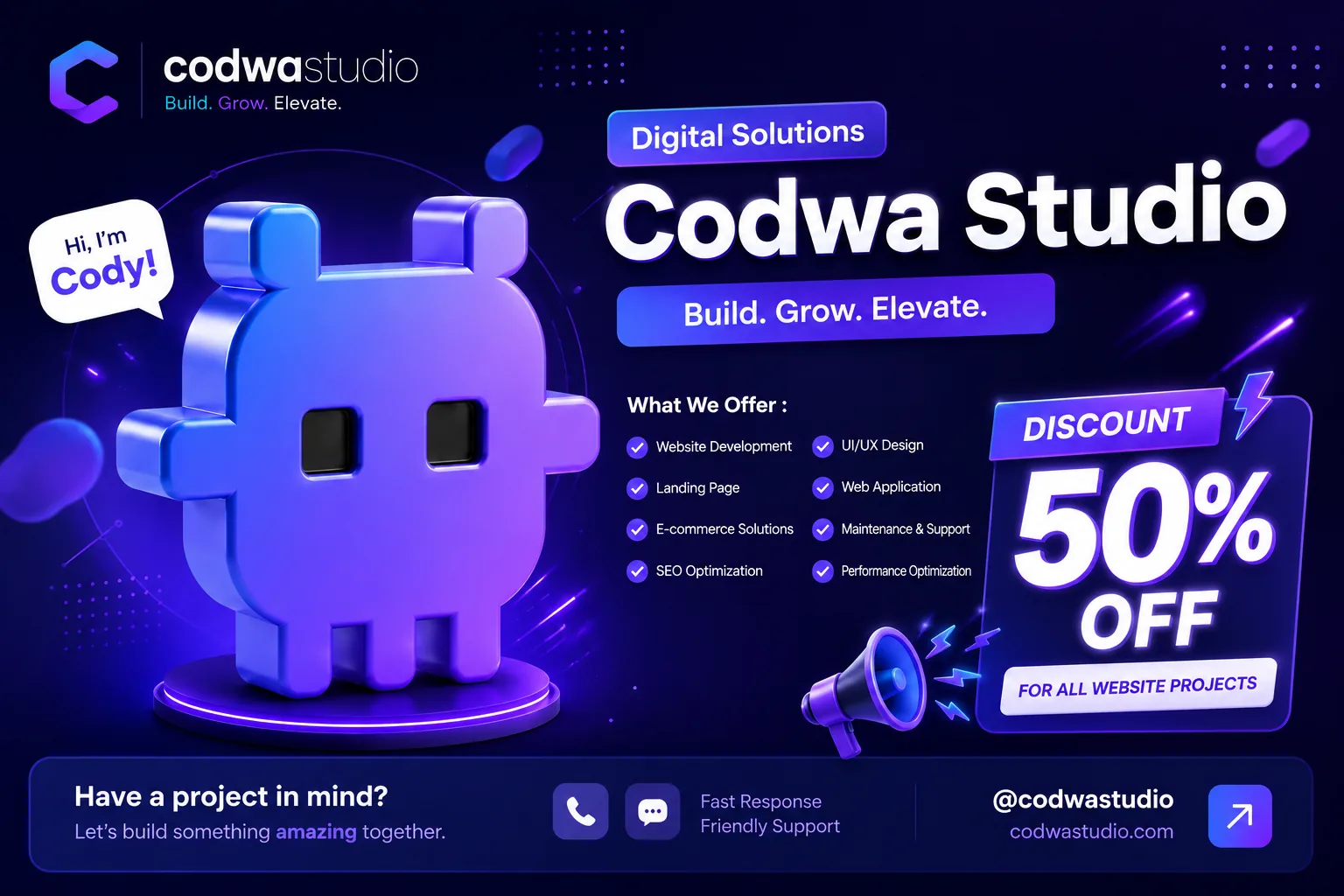
For many potential clients, your company website is the first thing they see, often before anyone on your team has said a word to them. They open it to confirm that the business is real, that it is clear what you do, and that you are worth contacting. A website that merely exists doesn't do that job. A credible one does.
This article covers five signs of a company profile website that makes a business look professional, along with a way to check each one yourself. You don't need any technical background to use it.
At a glance: five signs and how to check them
| Sign | Question it should answer | Quick check |
|---|---|---|
| A clear message and consistent design | What does this business do, and for whom? | Show the homepage to someone who doesn't know your business for 5 seconds, then ask what they took away |
| Complete business information | Who are you, what do you offer, how do I reach you? | Find the About, Services and Contact pages within two clicks of the homepage |
| Fast loading | Does the page appear right away on an ordinary connection? | Run PageSpeed Insights (free) on the homepage |
| Comfortable on a phone | Can everything be read and tapped on a small screen? | Open it on your phone and tap every button with one thumb |
| Real proof | What have you actually done, and what came of it? | Make sure there are project examples or work samples a visitor can look at |
1. A clear message and consistent design
Good design matters: a clean layout, a colour palette that matches your brand, and typography that is easy to read. But design only wraps the message. What visitors look for first is the answer to "what does this company actually do?"
The simplest way to test this is the 5-second test. Show your homepage to someone who has never heard of your business, take it away, and ask, "What kind of company is this?" If the answer is off or hesitant, the main message isn't clear yet, however good the page looks.
Go easy on decoration. Every animation, banner or icon that doesn't help a visitor understand your business pulls attention away from the text you want them to read.
2. Complete business information that is easy to find
A potential client wants to know three things: who you are, what you offer, and why they should choose you. At a minimum, a company profile website needs an About page, a list of services, and contact details that are easy to find without clicking around at random.
One sign we see often: the sales team sends PDFs or slide decks more often than a link to the website. That usually means the website doesn't explain the business well enough, so even the people inside the company don't feel comfortable relying on it. A good website should work as a single link you can send at any time, always up to date.
Write specifically. Generic copy such as "the best solution for your needs" doesn't set you apart from anyone. Name your services, the kinds of clients you work with, and how you work, in concrete words.
3. Fast loading
A slow page sends visitors away before they have read anything. The usual causes are simple: oversized images, too many sliders or animations, and code that hasn't been cleaned up.
You can measure this for free with PageSpeed Insights: paste in your address and look at the score on the Mobile tab. As a real example, FT3Flooring, a flooring installation website we built on WordPress, scored 99 for Performance on mobile and 97 on desktop in a PageSpeed Insights lab test on October 5, 2026. Keep in mind that this is lab data rather than measurements from real visitors, and scores can shift whenever a site changes. You can see the projects we have worked on.
The steps that usually make the biggest difference: shrink images before uploading them, use a modern format such as WebP, and don't load heavy elements on the homepage that don't need to be there.
4. Comfortable to use on a phone
Many potential clients open your website on a phone, often from a link someone sent them over WhatsApp. A page that looks tidy on a laptop isn't necessarily comfortable on a small screen. Three things are worth checking:
No sideways scrolling
The page should fit the width of the screen. If a table or an image runs past the edge and gets cut off, visitors lose part of the information without noticing.
Buttons big enough to tap
Google recommends tap targets of about 48×48 pixels, roughly the size of a fingertip pad; see the tap target guidance on web.dev. Small text links tucked inside paragraphs are easy to miss.
Floating buttons that don't cover important ones
When we tested our own pages on a 375-pixel-wide screen, we found that the floating WhatsApp button was covering the edge of the main call-to-action button near the top of the page. We fixed it by hiding the floating button while another WhatsApp button is visible. Problems like this only show up when you actually try the page on a phone.
5. Real proof, not just claims
A portfolio and testimonials help convince potential clients that your business has real experience. But the proof has to be something they can check.
If you don't have testimonials yet, don't invent them. Use what actually exists: the project name, what was done, the decisions that were made and, where possible, a link to the result. A short explanation of the scope of the work is often more convincing than praise with no source behind it.
One note: don't show result figures (for example, "increased sales by X percent") unless you can back them up. A single claim you can't stand behind can damage trust in all the rest of your proof.
Where to start if your website doesn't meet all five yet
The right approach depends on what material you already have. There are usually three situations:
| Where you are now | A sensible next step |
|---|---|
| You already have a website, but its structure and writing no longer match how the business works | Reorganise the structure and rewrite the copy of the existing site |
| You have a PDF profile, presentation or deck, but no website that brings it all together | Turn the existing material into a website structure |
| You don't have tidy written material yet | Write down your business story, services and work examples first, then build |
The order of work should be clear: review the material you have, plan the page structure, write or edit the copy together with the design, then build and hand over. Starting with design usually means the hardest part, the business message itself, gets decided last. If you're still unsure whether you need a company profile website or just a single promotional page, read landing page vs company profile website. For a sense of budget, see how much a company profile website costs for small businesses.
Frequently asked questions
Why isn't a PDF company profile enough?
A PDF is hard to keep up to date, isn't always comfortable to open on a phone, and is rarely found through search engines. A website gives you one link that is always current and that potential clients can find through Google.
How long does it take to build a company profile website?
It depends on how ready your material is and how quickly decisions get made. Usually a few weeks from the first discussion to going live.
Next step
Start with the 5-second test, PageSpeed Insights and a try-out on your own phone. Those three checks usually show which area needs attention first.
Talk to Codwa Studio about your company profile website
Reviewed by Riki Siahaan. Last updated: October 5, 2026.